
Introduction
This ad was designed by Apple Inc. in 2017 to advertise for their new line of smartphones. It depicts why users should switch from the smartphone that they currently have to a brand new apple phone.
Original Ad Analysis
Design
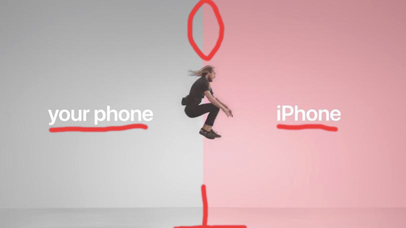
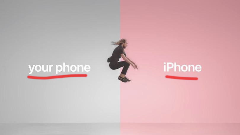
This shows the contrast between the two different colors of the design. The pink and grey allow for the viewer to clearly tell a difference between the two sides. This design has repetition in the fonts used for both of the sides. The split of the ad is aligned to the middle to draw a clear divide between the two different products. The man jumping in the middle is the same proximity from both sides, but since he is facing the Apple side, it shows that he is leaving his old phone for Apple.

Color
This draw over shows the difference used between the two colors used for both sides of the ad. On the left side is a monotone grey, with a warm pink on the right. This color choice was made to make the left side with the one phone look unappealing and boring, while the right side is warm and happy.
Typography
This draw over shows the typography used in the ad design. Apple has a set font that they use for all of their iPhone advertisements. An interesting choice is that they used this font for the old phone as well. I think this decision was made for continuity of the ad so that it didn’t feel too disjointed.
New Ad Analysis
Design
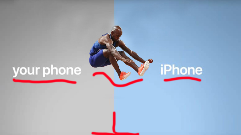
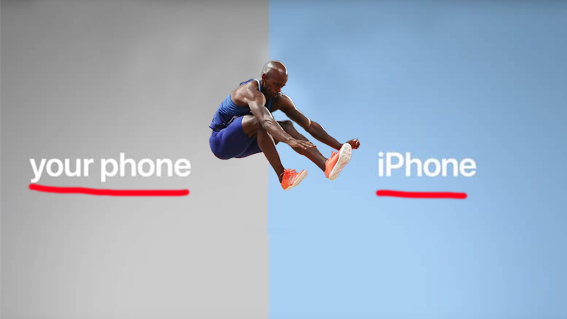
This new design keeps the same contrast as before with the two different sides. With the different colors and the hard line in the middle it clearly separates the ad. This shows repetition in the fonts for both sides, and also in a lot of similarities to the other ads in the campaign. The ad is aligned down the middle splitting the two sides in half with the subject also aligned in the middle. The proximity of the subject in the middle is equal to both sides, but like before he is clearly jumping from one side to the other showing which place he wants to be.

Color
This draw over emphasizes the different colors used in this design. The left side is grey to show that it is undesirable while the right is bright and blue, which is a much more inviting color.
Typography
This draw over showcases the fonts used in this ad. Like before, the classic Apple iPhone font is used for both sides. I make the same argument in saying that this was done for continuity of the add to make sure it did not feel disjointed.
Conclusion
The original ad and my new addition ad both work together great for the same ad campaign. They both follow the same format and are extremely similar, but just have a couple key differences to show that they are different. By keeping the continuity of the same ad campaign, it allows for viewers to get familiar with and recognize the ad more easily.
